
12 Best Shopify Webshop Examples from the Netherlands (2026)
 Patrick Verhoeks
 The best Dutch Shopify webshops of 2026, organized by industry. Discover which technical choices make them convert — and what you can apply to your own store.
Building a new Shopify webshop or refreshing an existing store? Looking at high-performing webshops is one of the best ways to learn what actually works — not in theory, but in practice.
In this article I share 12 Dutch Shopify webshops from 2026, organized by industry. For each store I explain which technical choices or UX decisions make it so effective — so you can take concrete lessons and apply them to your own shop.
What actually makes a Shopify webshop good?
Before we dive into the examples: here are the criteria I used to assess each store.
Fashion & Apparel
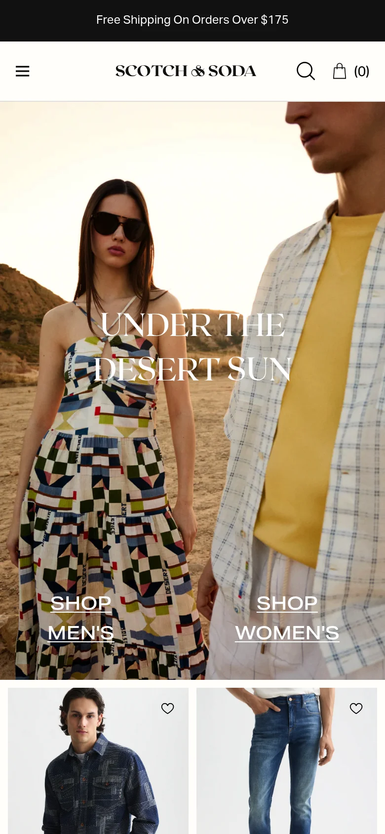
1. Scotch & Soda — Premium Shopify Plus at international scale
Scotch & Soda is the textbook example of a Dutch fashion brand that fully leverages Shopify Plus. The brand sells in dozens of countries from a single backend, with localised checkouts per market via Shopify Markets.
What they do technically smart:
- Shopify Markets per country — separate URL, currency and payment method per region
- Fast despite heavy imagery: WebP compression + aggressive lazy loading
- Variant selection (size + colour) without page reload via Ajax cart
- Consistent brand identity from homepage to post-purchase thank-you page
Shopify plan: Shopify Plus
Lesson for your shop: If you want to sell in multiple countries, Shopify Markets is the smartest approach. You don’t need to manage separate webshops per country — one backend, multiple storefronts.
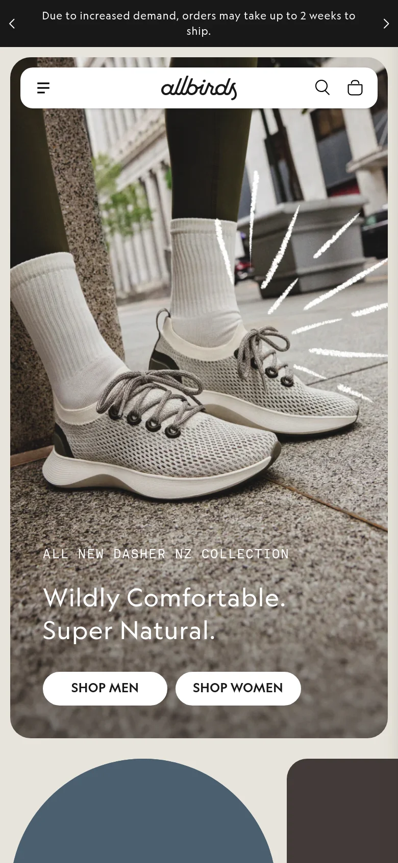
2. Allbirds — Sustainable shoes with minimalist product variant UX
Allbirds shows how to keep an extensive range (dozens of colours and materials per model) manageable. Their Shopify store is built around radical simplicity: as little decision fatigue as possible, and a fast path to checkout.
What they do technically smart:
- Product variant display stays minimal despite dozens of colour and material options per shoe
- Sustainability data (carbon footprint) visible directly on the product page
- Extremely fast load times despite rich imagery — under 2s LCP
- Shopify Markets for NL, DE, FR and UK from one backend
Shopify plan: Shopify
Lesson for your shop: Many variants don’t need to mean a chaotic product page. Good UX means customers quickly make the right choice — not that they see everything at once.
3. Cluse — Headless Shopify for a premium watch experience
Cluse (Amsterdam) is a great example of headless Shopify: the frontend is fully custom-built, while Shopify handles the order process, inventory and payments in the background.
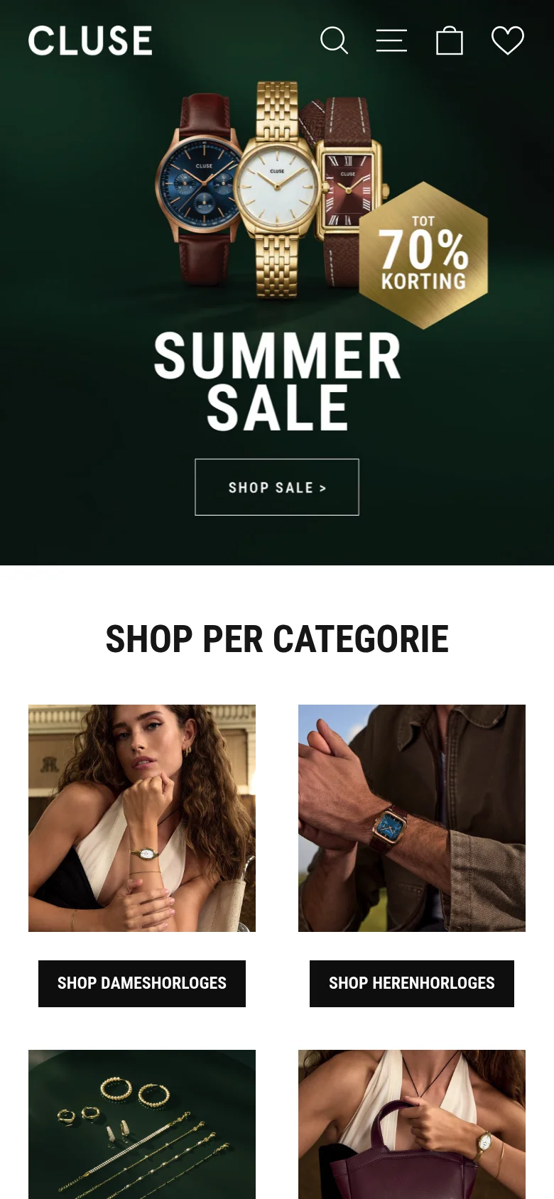
What they do technically smart:
- Headless architecture: custom frontend gives complete design control
- Ultra-fast product pages despite high-res watch photography
- ”Shop the look” feature: click products directly from lifestyle photos
- Strap configurator: choose case + strap + colour without page reload
Shopify plan: Shopify Plus (headless)
Lesson for your shop: Headless Shopify isn’t necessary for everyone — but if you want designs that go beyond what a standard theme offers, it’s worth exploring. More than 90% of shops do perfectly well with a standard or lightly customised theme.
4. 10Days Lifestyle — Lifestyle apparel with storytelling as a conversion engine
10Days proves that with strong brand photography and good copy you can build a webshop that feels like a magazine. The campaign visuals tell a story that sells the products naturally.
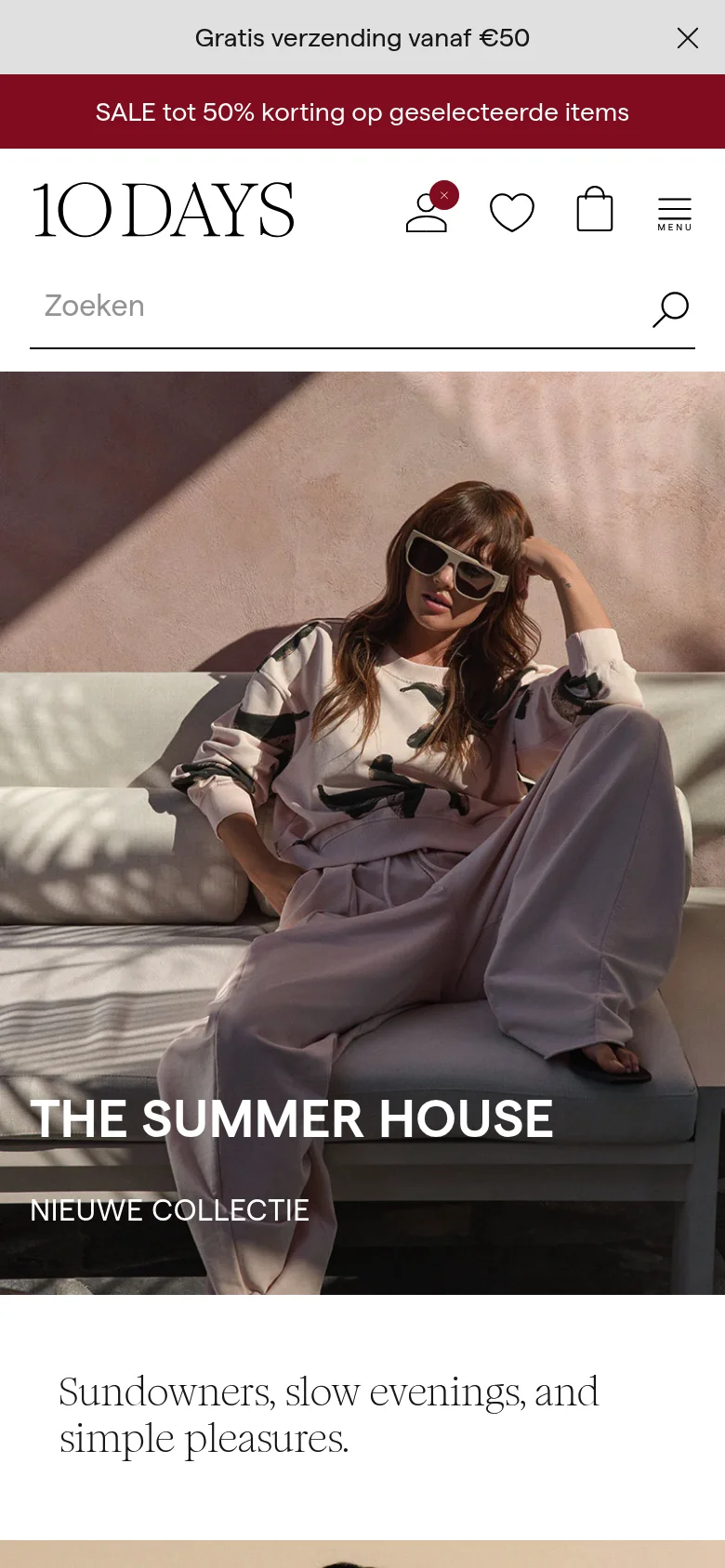
What they do technically smart:
- Campaign pages alongside product pages: inspiration + conversion in one place
- Instagram feed integrated on the homepage for social proof
- Lookbook feature: outfits made shoppable from a single lifestyle image
- Blog and campaigns build authority and returning visitors
Shopify plan: Shopify
Lesson for your shop: Invest in brand photography. The ROI on great product imagery is higher than almost any ad campaign — it works 24/7 without additional budget.
Food & Beverages
5. Tony’s Chocolonely — Mission-driven D2C commerce
Tony’s Chocolonely is more than a chocolate brand — it’s a mission wrapped in a webshop. The Shopify store reflects that mission in every pixel: colourful, playful and driven.
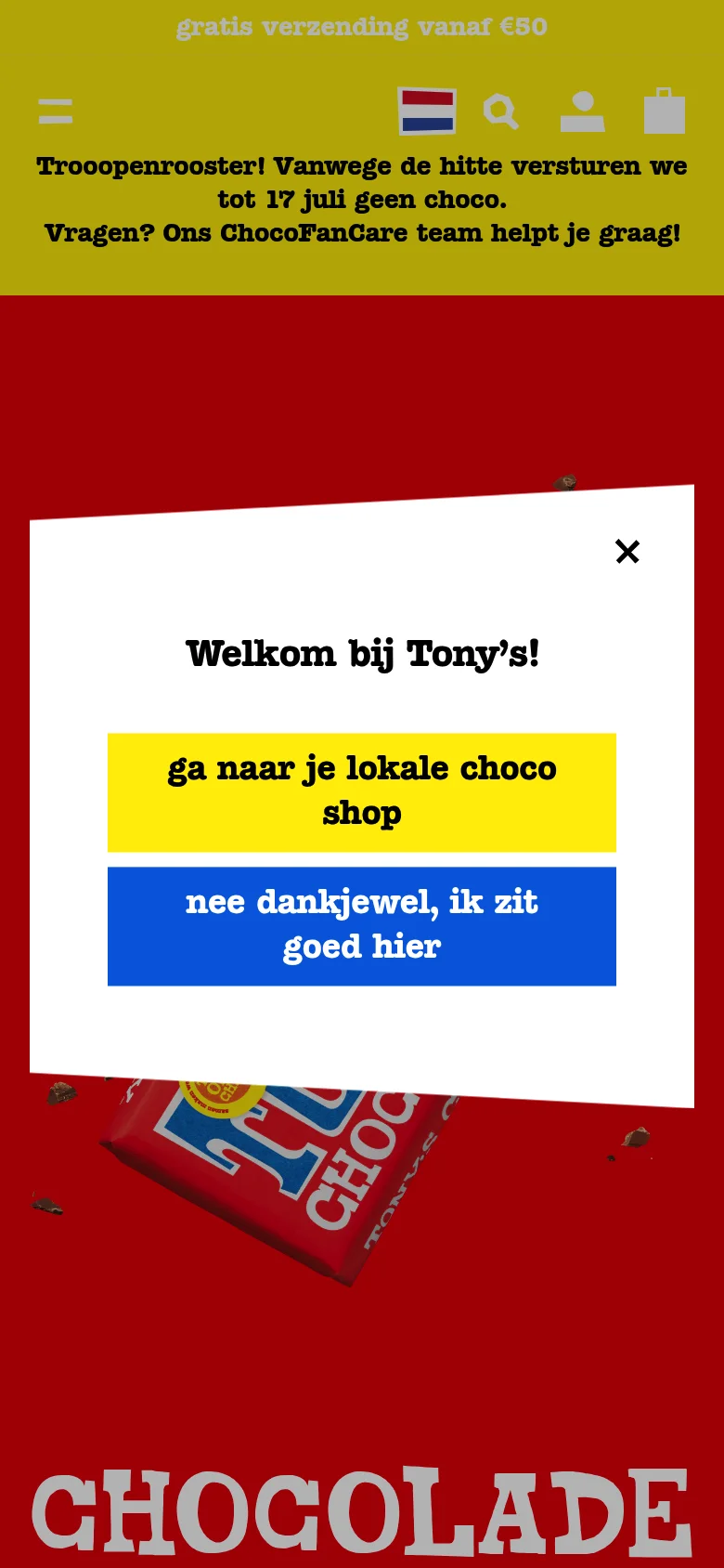
What they do technically smart:
- Product bundling: gift sets and packages significantly increase average order value
- Mission story integrated into the product page — not a separate “About us”, but a continuous narrative
- Seasonal collections (Easter, Christmas) are seamlessly switched without downtime
- International shops per language/region via Shopify Markets
Shopify plan: Shopify
Lesson for your shop: Your “why” is a conversion tool. Customers who understand why you do what you do buy faster and come back more often. Weave your story into the product page, not just a separate “About us”.
Streetwear & Premium Footwear
6. Filling Pieces — Amsterdam sneakers with international D2C scale
Filling Pieces is an Amsterdam premium sneaker and clothing brand founded in 2009 by Guillaume Philibert. What started as a niche footwear label has grown into a global D2C brand selling across the EU, UK, US and Canada — all from a single Shopify backend.
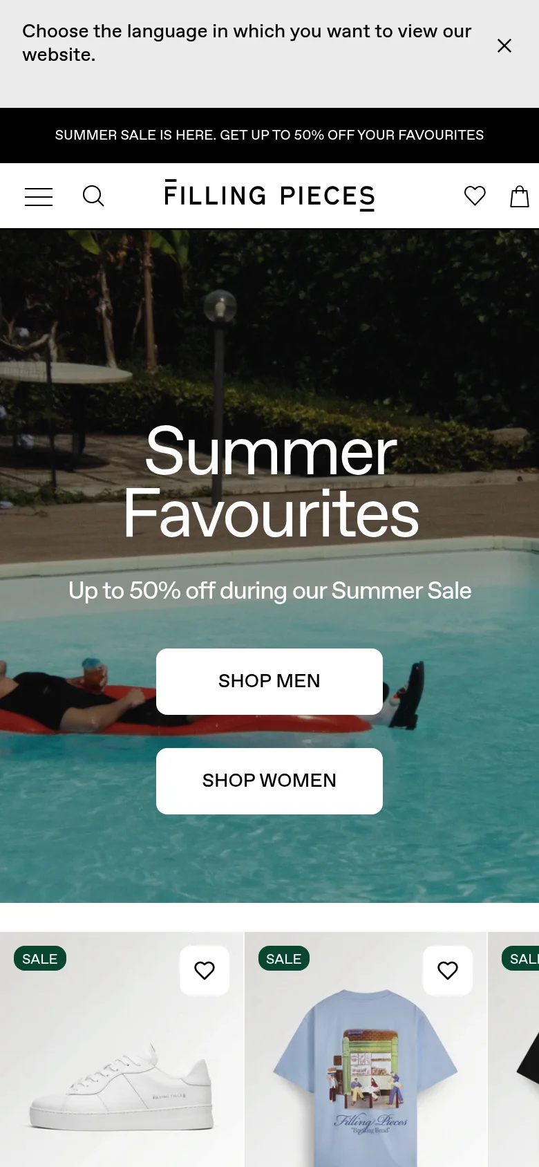
What they do technically smart:
- Multi-currency and multilingual (NL/EN/DE) from a single Shopify backend — no separate storefronts
- Loyalty programme “Unity” integrated directly into the store: points, rewards, early access
- Campaign content (Heineken x Filling Pieces, Keti Koti collection) drives D2C conversion
- Checkout with iDEAL, Klarna, Shop Pay and Apple Pay all in one flow
Shopify plan: Shopify Plus
Lesson for your shop: International scale doesn’t necessarily require a headless setup. Filling Pieces achieves global D2C growth with a well-customised Shopify store and invests in campaign content and customer loyalty rather than expensive infrastructure.
Home & Lifestyle
7. Tables by Tim — Shopify + custom configurator with AR
Tables by Tim (Utrecht) shows how far you can push Shopify with custom development. Customers configure their dining table in a 3D configurator, see the price update live, and can place the table virtually in their living room via Augmented Reality.
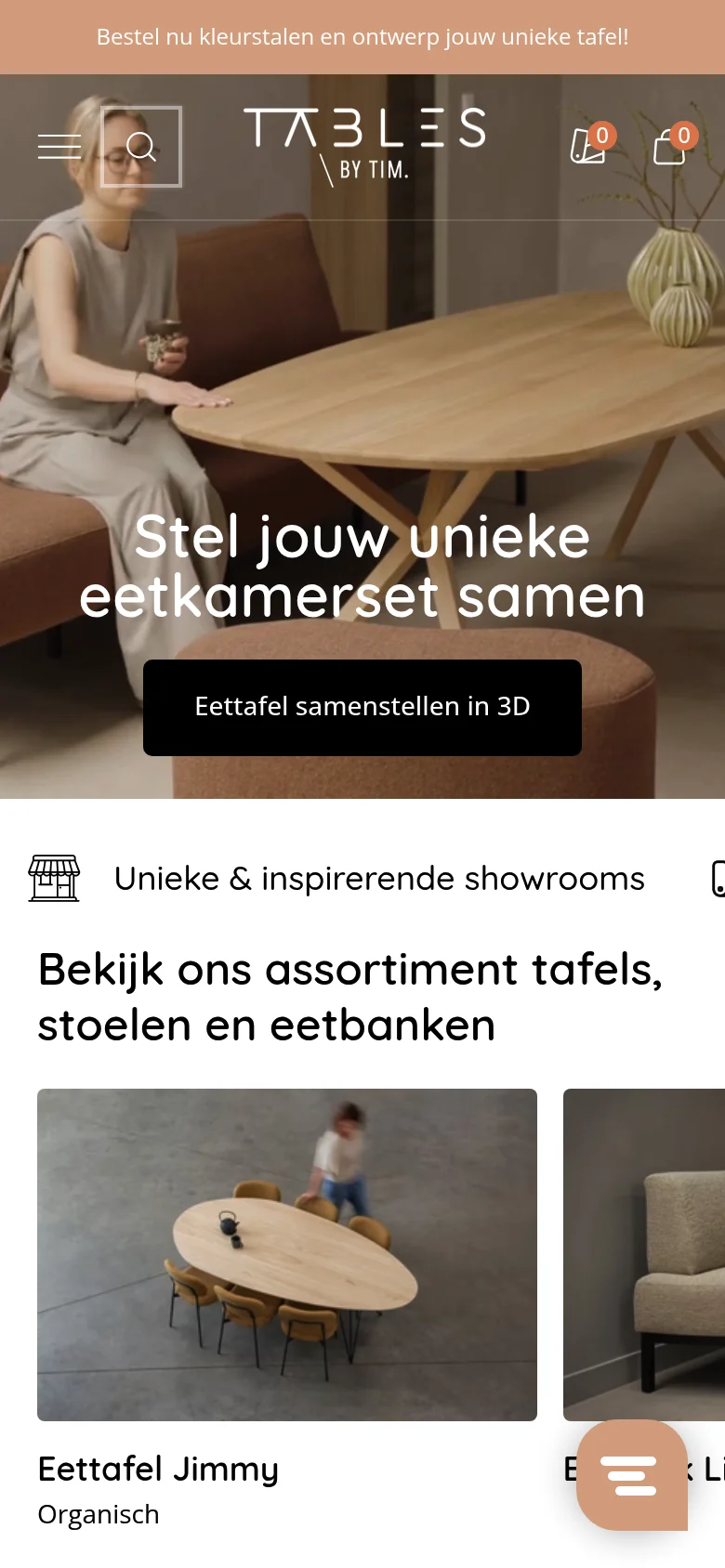
What they do technically smart:
- 3D product configurator directly in Shopify: choose dimensions, wood, legs and finish
- AR preview (Augmented Reality) via the mobile camera — no separate app needed
- Automatic price calculation based on chosen configuration
- Sample order flow for customers who want to see materials first
Shopify plan: Shopify
Lesson for your shop: For configurable or custom products, a smart order process is worth gold. It reduces the number of pre-purchase questions and increases buyer confidence before checkout.
8. Easywalker — Headless Shopify for a premium pushchair experience
Easywalker (The Hague) sells premium pushchairs via a headless Shopify setup. Shopify manages the backend (inventory, orders, payments) while the frontend is fully custom-built for maximum brand control.
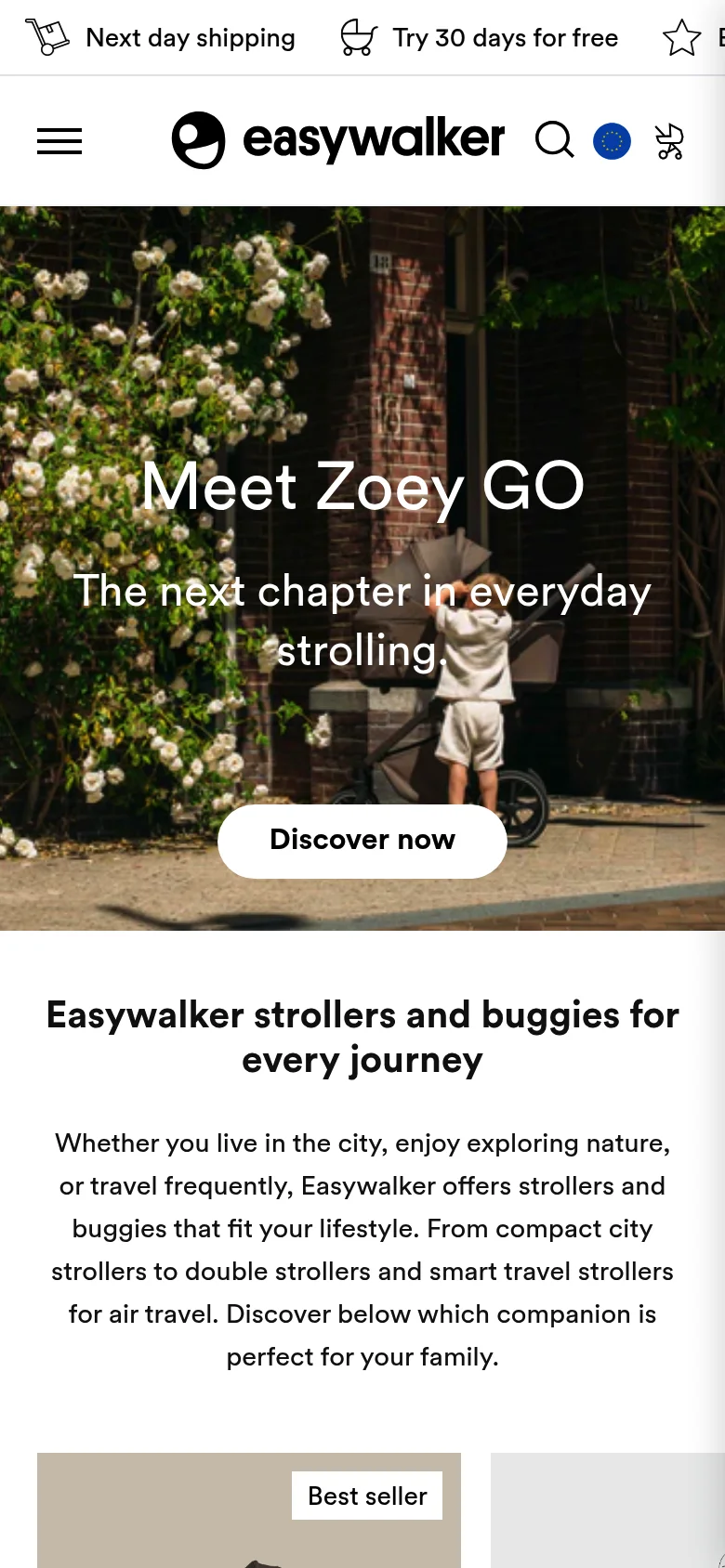
What they do technically smart:
- Headless frontend with Contentful CMS: marketing can update content without a developer
- International landing pages per market (NL, DE, UK, FR)
- Product pages with detailed specification comparison
- Dealer map: consumers can navigate to the nearest physical retailer
Shopify plan: Shopify Plus (headless)
Lesson for your shop: Headless is powerful but expensive. Only consider it if you’re genuinely hitting the limits of a standard theme and have a significant development budget.
Sport & Outdoor
9. Gymshark NL — Shopify Plus for peak traffic
Gymshark started on Magento. When their system crashed during Black Friday with hundreds of thousands of simultaneous visitors, they migrated to Shopify Plus — and have since grown into a billion-pound brand.
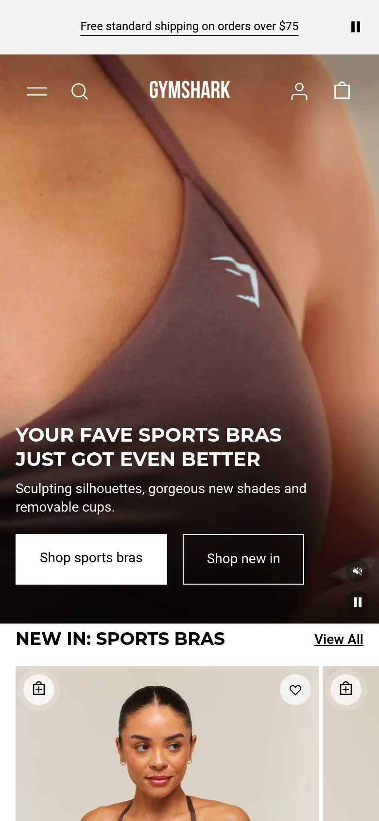
What they do technically smart:
- Shopify Plus handles Black Friday peak traffic without downtime
- Product videos on every product page — no static images
- Advanced collection filters: sport, fit, colour, size simultaneously
- Mobile checkout optimised for speed: Shop Pay, Apple Pay
Shopify plan: Shopify Plus
Lesson for your shop: If you expect your shop to face peak traffic situations (seasonal campaigns, flash sales, PR moments), Shopify is one of the few platforms that can handle it without crashing — even without Plus.
Seasonal & International
10. Rivièra Maison — Premium home lifestyle with visual storytelling
Rivièra Maison (Born, Noord-Brabant) combines an extensive product catalogue with a rich lifestyle experience. Their Shopify Plus store translates the atmosphere of the physical shops entirely into digital.
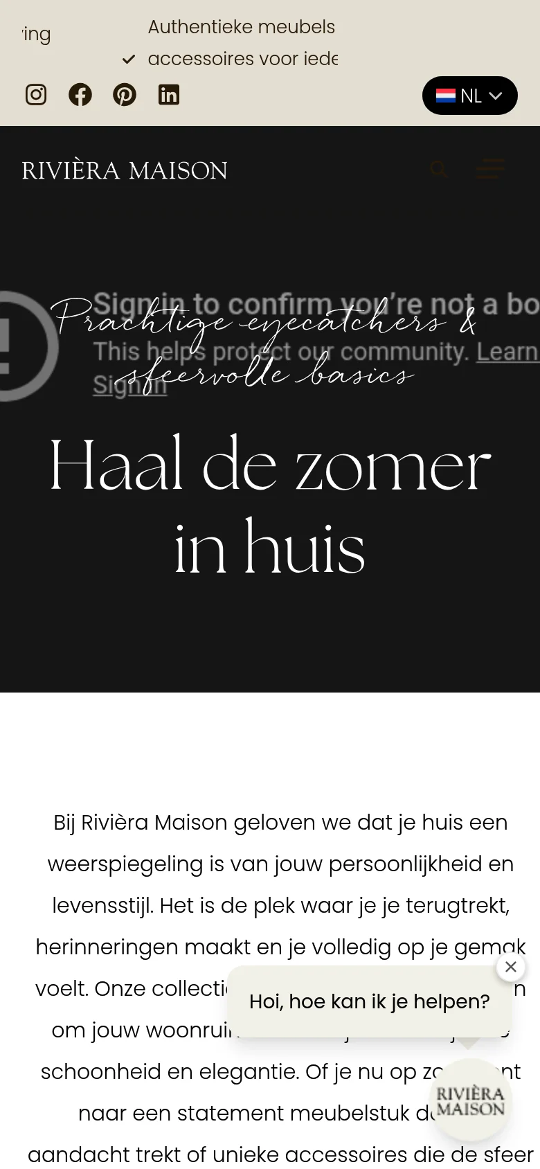
What they do technically smart:
- Extensive filters on collection pages: style, colour, room, material
- Per-collection lifestyle photography gives context and lifts conversion
- ”Shop the look”: inspiration images linked directly to product pages
- Shopify Markets for BE, DE, FR and UK alongside the Dutch shop
Shopify plan: Shopify Plus
Lesson for your shop: Lifestyle photography does more than product shots alone. Showing products in context — in a styled room, on a set table — raises average order value and reduces returns.
Kids Fashion
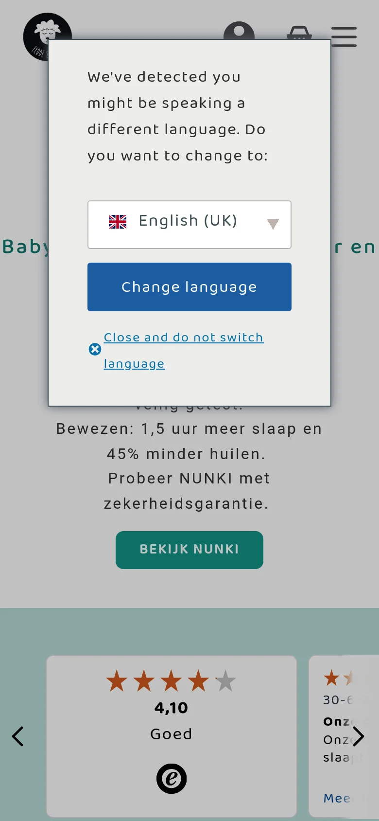
11. Fedde & Kees — Colourful kids clothing with a loyal parent community
Fedde & Kees is a Dutch children’s clothing brand with a bold, colourful style and a close-knit community of young parents. The shop runs on Shopify and has been featured by multiple Dutch Shopify agencies and bloggers as a strong example of smart brand experience.
What they do technically smart:
- Navigation by age and season: parents find what they need in two clicks
- Gift wrapping option at checkout — small addition, big impact on the customer experience
- Outfit photography with multiple pieces per look — cross-selling without being pushy
- Active Instagram community used as social proof on product pages
Shopify plan: Shopify
Lesson for your shop: A clearly defined audience (busy parents who want to check out fast) calls for a frictionless checkout. Small additions like gift wrapping and clear size information by age can meaningfully lift your conversion rate.
Accessories & D2C
12. Ekster — Rotterdam smart wallets at global D2C scale
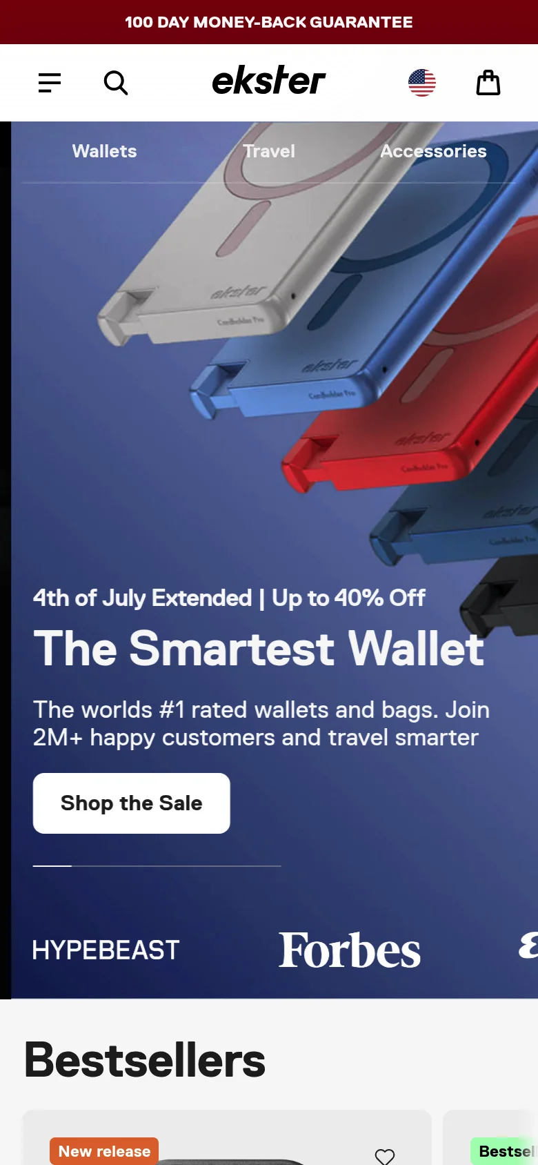
Ekster (Rotterdam) is one of the most successful Dutch D2C brands of recent years. Their Shopify Plus store sells smart wallets in dozens of countries, combining viral marketing campaigns with a clean, conversion-focused design.
What they do technically smart:
- Product pages with animated demonstrations of the tracker feature
- Bundle builder: combine colour, model and accessories to increase AOV
- Shopify Markets for EU, US, UK and Australia from one backend
- Fast, mobile-first checkout built for an international audience
Shopify plan: Shopify Plus
Lesson for your shop: Product animations and demo visuals on the product page increase product understanding and conversion — especially when you’re selling something with a unique feature that needs to be seen to be understood.
What do these Shopify webshops teach us?
After dozens of Shopify projects and studying the best Dutch stores, these are the patterns that consistently emerge:
Get your Shopify webshop built
Want a Shopify webshop that converts and looks professional? As an official Shopify Partner, we build Shopify webshops for ambitious Dutch SMEs — with a focus on design, speed and conversion.
Frequently asked questions
-
Which major Dutch brands use Shopify?
Many well-known brands run on Shopify (Plus): Scotch & Soda, Tony's Chocolonely, Allbirds, Cluse and Gymshark are well-known examples. Fast-growing brands like Filling Pieces, 10Days and Rivièra Maison also use the platform.
-
Is Shopify suitable for Dutch webshops?
Yes. Shopify supports iDEAL, Bancontact, Dutch VAT settings and Shopify Markets for multiple languages and currencies. The platform is fully available in Dutch — including the checkout for your customers.
-
What makes a Shopify webshop successful?
The best-performing Shopify stores combine four things: a fast, mobile-first frontend (under 2.5 seconds LCP), strong product presentation with professional photography, a frictionless checkout, and a consistent brand experience from homepage to thank-you page.
-
Can I get a custom Shopify webshop built in the Netherlands?
Yes. As an official Shopify Partner we build custom Shopify webshops for Dutch SMEs — covering design, technology and SEO. You always get a fixed price upfront, no hourly billing.
-
What is the difference between Shopify and Shopify Plus for Dutch shops?
Shopify Plus is the enterprise variant for shops with high order volumes or complex requirements (custom checkout design, B2B channel, multi-storefront). Large Dutch brands like Scotch & Soda and Gymshark run on Shopify Plus. For most SMEs, Shopify Basic (€28/month) or Grow (€78/month) is more than enough.
- #shopify webshop examples
- #successful webshops
- #shopify nl
- #best webshops netherlands
- #shopify netherlands
